
If an infographic doesn’t send a clear message to the viewer, it isn’t properly doing its job. As a designer, I am always on the lookout for creative infographics and noting what elements caught my eye. Here are my favorite infographics from my own Franco portfolio.
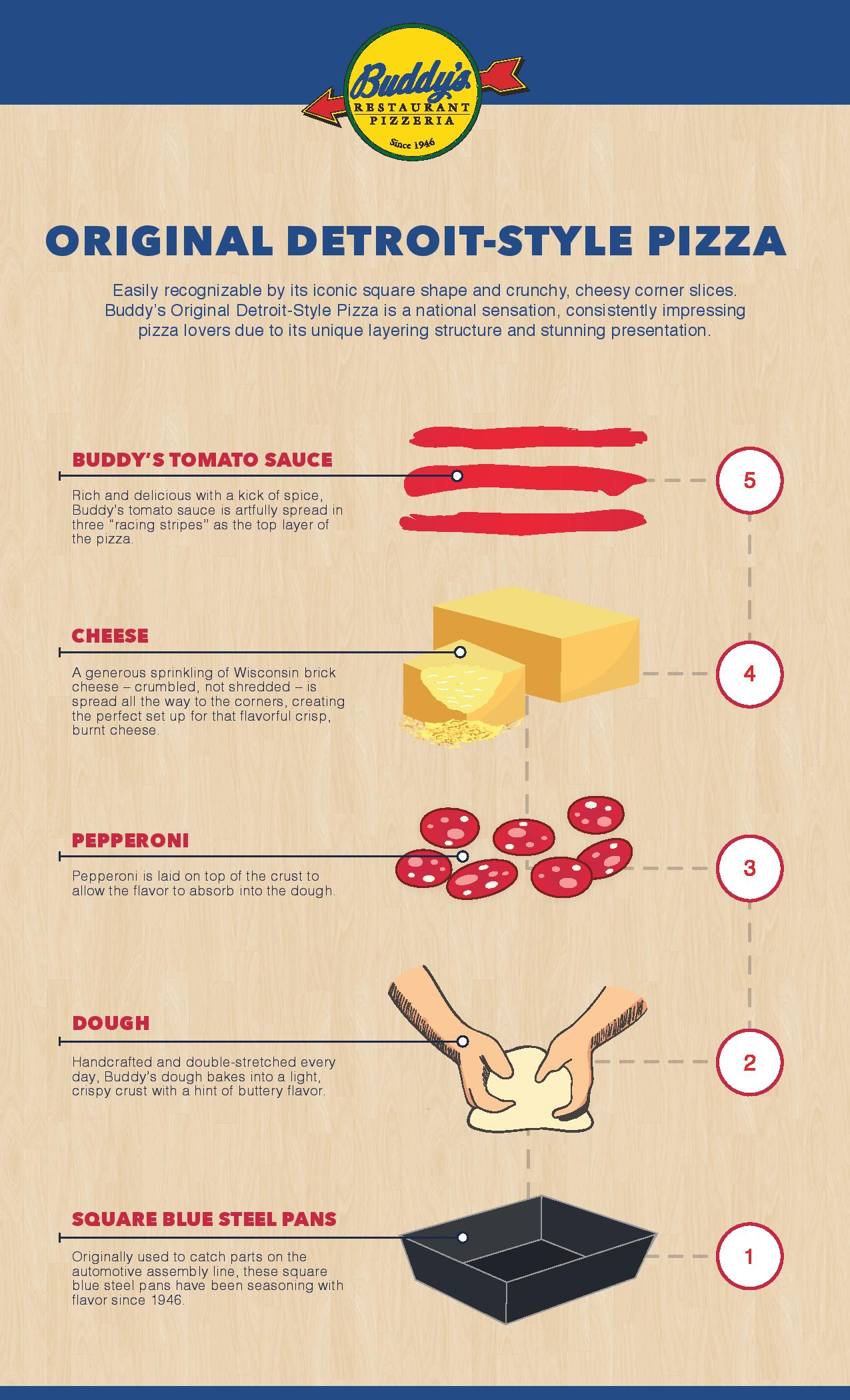
Buddy’s Pizza
Buddy’s is the Original Detroit-Style Pizza and this infographic was created to illustrate the unique construction of a “Detroit-style” pizza versus traditional pies. This how-to-approach was a simple way to visually balance imagery with description.
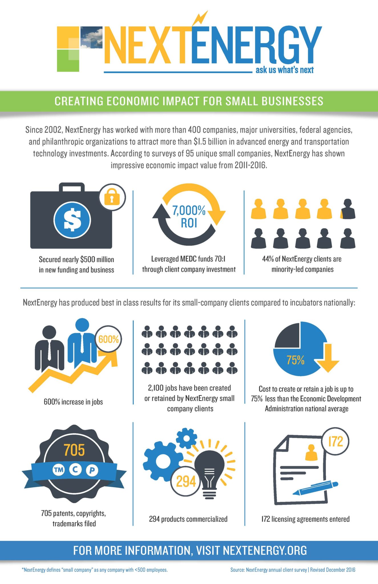
NextEnergy
White space is a great design element, but there’s a fine line between its effectiveness and too much. While the content focuses on NextEnergy’s economic impact for small business, the clean look of this infographic subtly reinforces the organization’s commitment to clean, technologically advanced energy solutions.
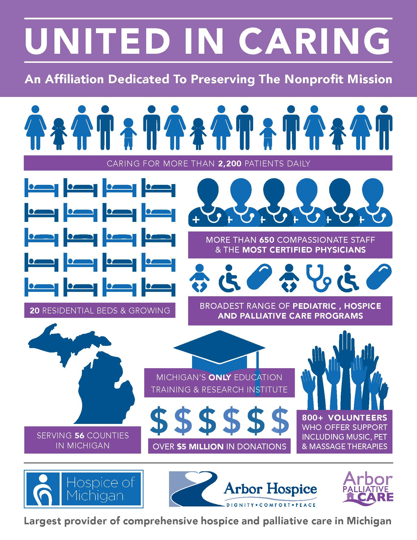
Arbor Hospice/Hospice of Michigan (HOM)
This is the first infographic I created when I started with Franco. I was challenged to show the combined strength of Hospice of Michigan and Arbor Hospice upon the not-for-profit organizations’ affiliation in 2015. The purple and blue color scheme was a visual blending of HOM and Arbor’s individual colors.
automotiveMastermind
There are times an infographic is the first design project for a client and that establishes a creative direction for ongoing collateral. That was the case with this automotiveMastermind infographic, which features a variety of performance stats for its technology to help dealers identify, communicate with and close buyers in their market.

DataFactZ
In the serious world of financial service companies, this bright and bold social infographic for DataFactZ stands out. It was designed to illustrate how DFZ’s analytics services can help predict fraud for financial businesses faster and earlier than traditional methods. The sleuth graphic provides an additional unexpected, light-hearted touch.

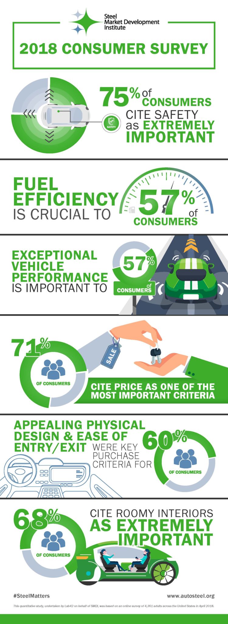
Steel Market Development Institute (SMDI) (Consumer Survey)
This infographic breaks down the key takeaways of an in-depth Steel Market Development Institute (SMDI) consumer survey. The challenge was condensing large amounts of data and information into quick points that could be easily shared and understood in presentations and on social media.
SMDI Construction (Sustainability)
A primary goal of the Construction arm of the Steel Market Development Institute is to tout the benefits of steel vs. wood in building construction. This point-by-point comparison of steel’s sustainability benefits over wood building products is impactful and eye-catching. 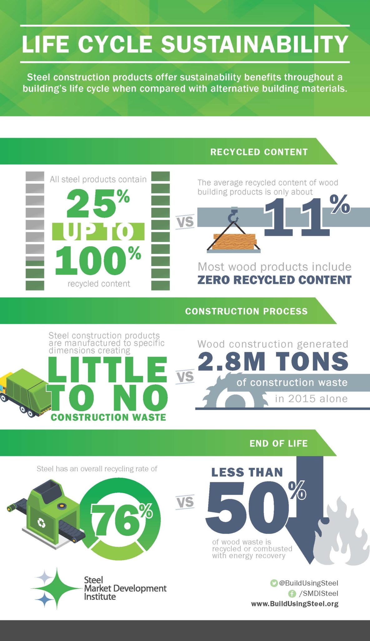
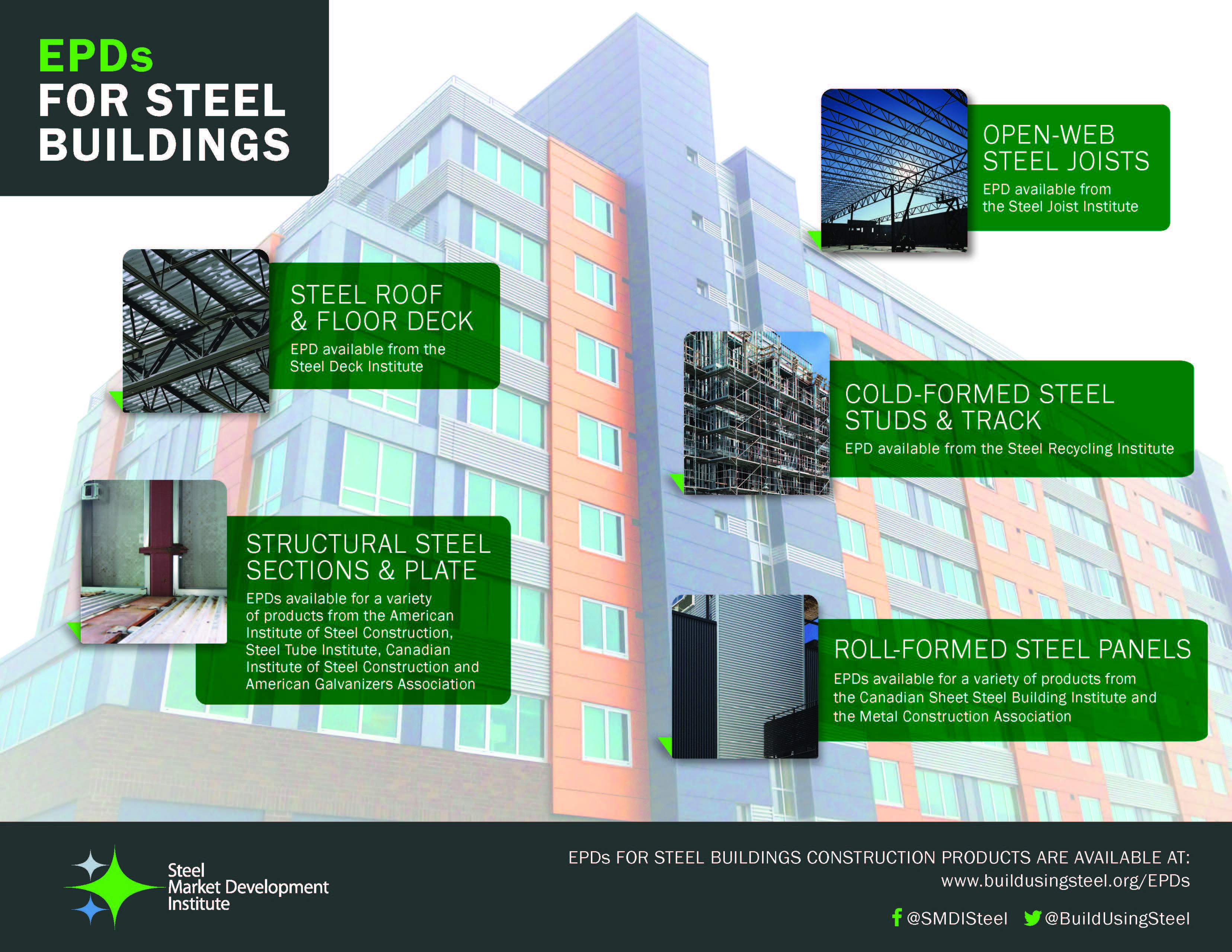
SMDI (Environmental Product Declarations)
Builders need a lot of sustainability data when trying to earn green building certifications like LEED. The Steel Market Development Institute asked for an infographic to summarize data available in the form of Environmental Product Declarations, or EPDs, for a range of steel products. A twist to this assignment was to create something that could serve both as a social media graphic as well as a tradeshow exhibit design element.

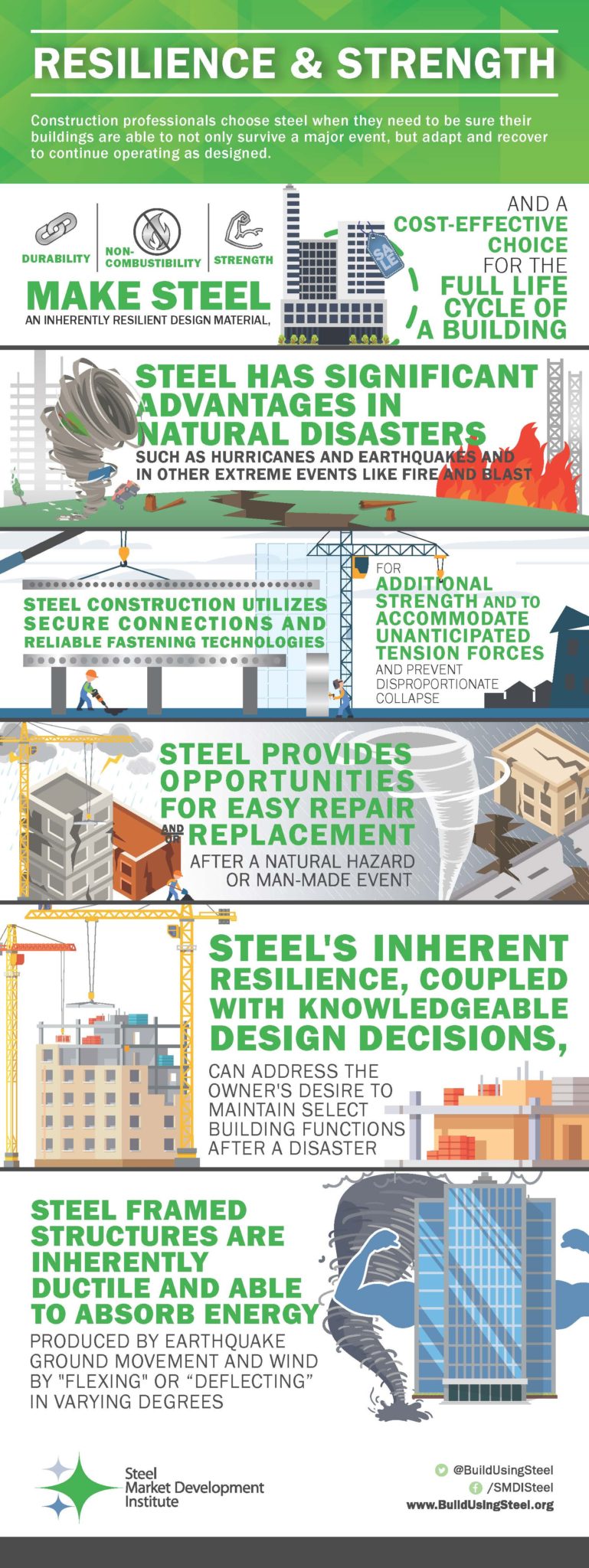
 SMDI Construction
Clients like SMDI Construction often have a large amount of information – sometimes without statistics – that needs to be broken down into easy-to-digest nuggets for infographics. The mix of varying size, boldness and color of the text presents the copy in a visual way and helps main points pop. The use of line art and rule lines creates definition around the individual messages.
Need help creating your next infographic or collateral materials? Contact us today!
Ashley Dupuy is a senior designer at Franco. You can reach her at [email protected].